Color Theory for Quilters: Choosing the Perfect Palette for Your Next Project
Share
When it comes to quilting, selecting colors that complement one another can make or break your final design. Understanding basic color theory will help you pick the right hues and create stunning quilts that are as beautiful as they are harmonious.
Let’s dive into the world of color theory and explore some tried-and-true color combinations for your next quilt.
Understanding the Color Wheel
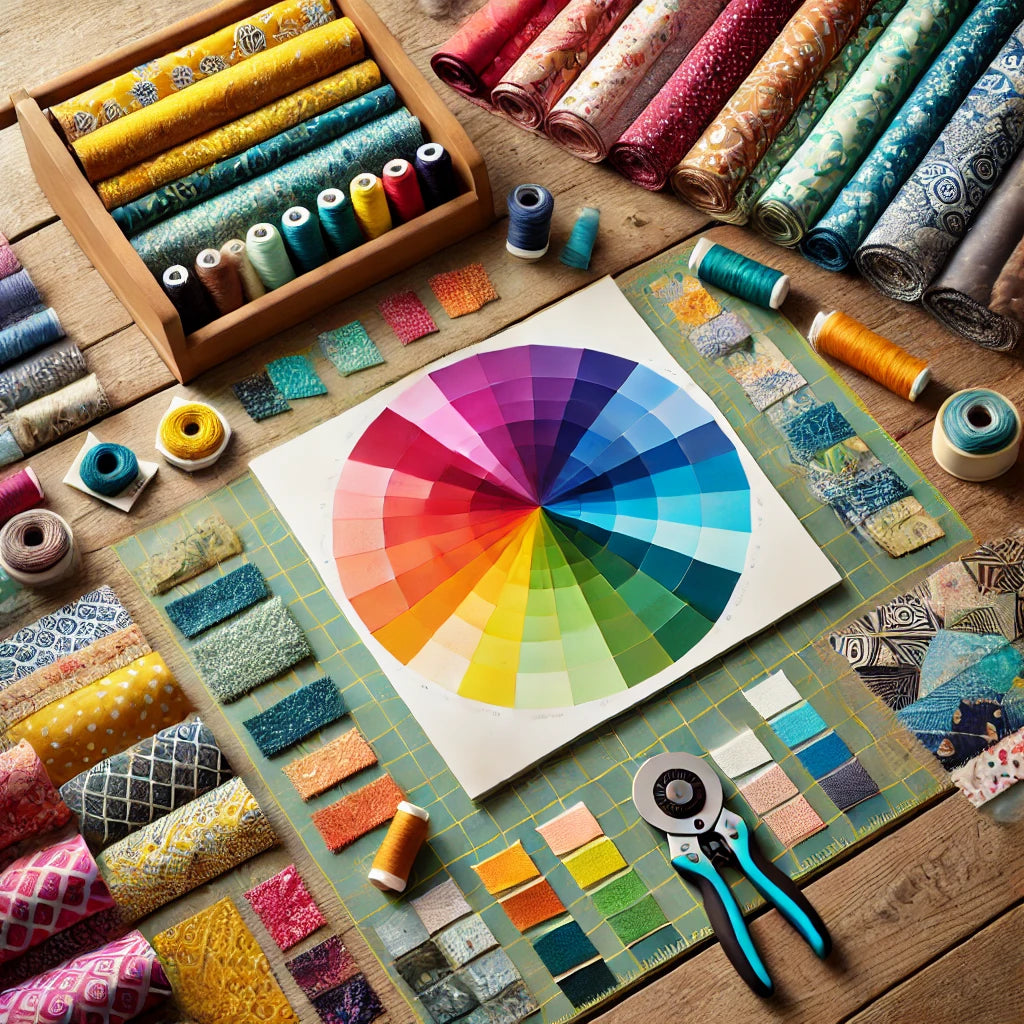
The color wheel is a quilter’s best friend! It’s a visual representation of colors arranged by their chromatic relationship, starting with primary colors (red, blue, yellow), then secondary colors (green, orange, purple), and tertiary colors (a mix of primary and secondary colors).
The color wheel is divided into three main sections:
- Primary Colors: Red, blue, and yellow. These are the foundation of all other colors.
- Secondary Colors: Green, orange, and purple, created by mixing two primary colors.
- Tertiary Colors: Red-orange, yellow-green, blue-purple, etc., made by mixing a primary with a secondary color.
Color Combinations That Work
Here are some popular color schemes to consider for your quilt:
1. Complementary Colors
Complementary colors are opposite each other on the color wheel, like red and green, blue and orange, or yellow and purple. These combinations create a vibrant contrast that makes your quilt design pop! However, using too much of both colors can be overwhelming, so balance is key. A little bit of one color can go a long way.

Tip for Quilters: Use one color as your dominant shade and its complement as an accent. For example, a green quilt with red binding or appliqué can add just the right amount of contrast.
2. Analogous Colors
Analogous colors sit next to each other on the color wheel. Examples include blue, blue-green, and green, or red, red-orange, and orange. This palette creates a serene, cohesive look—ideal for quilts where you want the colors to blend smoothly together.

Tip for Quilters: Pick one color as the main focus and use the other two for shading or accents. If you're creating a landscape or nature-inspired quilt, this is an excellent option for capturing a harmonious feel.
3. Triadic Colors
Triadic color schemes are made up of three colors evenly spaced around the color wheel. One popular triadic palette is red, blue, and yellow. These combinations are vibrant but balanced, giving your quilt energy without clashing.

Tip for Quilters: If you’re working with a triadic scheme, you may want to use one color more prominently and the other two as accent tones. This prevents the colors from competing with each other while still giving your quilt an exciting, dynamic look.
4. Monochromatic Colors
A monochromatic color scheme uses varying shades and tints of the same hue. This creates a very sophisticated and understated look. It’s perfect for minimalist designs or modern quilting projects where subtlety is key.

Tip for Quilters: You can add texture and interest to a monochromatic quilt by varying fabric patterns. For example, a quilt done in various shades of blue can feature polka dots, stripes, and solids in different tones to give depth and movement to the overall design.
5. Split-Complementary Colors
This scheme is a variation of complementary colors, but instead of using the color directly opposite, you select the two colors on either side of its complement. For instance, instead of pairing red with green, you would pair red with blue-green and yellow-green. This offers the contrast of complementary colors but is a little softer on the eyes.

Tip for Quilters: Use this scheme when you want a striking but not overly bold look. It’s great for giving your quilt contrast while keeping the overall tone balanced.
Warm vs. Cool Colors
It’s also essential to understand the emotional and visual impact of warm and cool colors.
- Warm Colors (reds, oranges, yellows) feel cozy and energetic. They tend to advance, making them stand out in your quilt design.
- Cool Colors (blues, greens, purples) are calming and recede into the background, creating a soothing effect.
Tip for Quilters: Mix warm and cool colors in your design to create depth and visual interest. For example, a cool blue background with warm orange accents can make the foreground elements of your quilt really pop.
Putting It All Together
Choosing colors for a quilt can seem daunting at first, but once you have a basic understanding of color theory, it becomes a fun and creative process. Here are a few final tips to keep in mind:
-
Use a Color Wheel: When in doubt, consult a color wheel. It can help you quickly identify complementary, analogous, and triadic colors that work well together.
-
Play with Contrast: Experiment with light and dark values to create contrast. Even in a monochromatic quilt, the contrast between light and dark fabrics can add visual interest.
-
Trust Your Eye: Sometimes the best color combinations are the ones that you simply love. Don’t be afraid to go with your gut and experiment with colors that feel right to you.
Understanding color theory can elevate your quilt-making by helping you choose fabrics that create harmony, contrast, and beauty. Whether you’re aiming for a bold, high-contrast design or a subtle, cohesive palette, there’s a color combination to suit every quilter’s style. Next time you're planning a quilt, let the color wheel guide you to a perfect palette that will bring your vision to life!
Happy quilting!
P.S. Now that you have your fabric, let’s take a look at starching in this blog post.